geometric shapes in art 3

3

The last of the three categories covers “Elbrouz-II”, which is again by Varsely is another interesting piece of work. This time it is much more complicated than the others and seems to follow no form or style, it simply places shapes all around the composition making it quite interesting. But with a bit of a more deeper look within this category, it has also, like the others been broken down. There seems to be images that uses the shapes to provide the most information about the image, and the shapes are there to provide context much like these images;

2 5 4 3

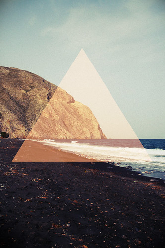
In another the shapes over the top of the original image have been used to simply distort the original form of the image which makes the image more complex and harder to understand. These are some great examples of this;

6 10 9 8 7

Next you notice in this final sub category, you will notice the shapes are the entire form of the image and they are completely made from the image filled shapes. This makes for some really complex but interesting visuals and you can see a few examples of this here;

11 14 13 12

geometric shapes in art 2

2

“Vonal Zoeld” by Victor Visarely is another image that seems to have influenced modern day design. In this image I am covering how the repetition of the shapes within the image gives the art an additional depth that it would not have had.

2

The best initial example of this in modern day use is the album cover of a Shlohmo track “camping”, they have literally printed the image out multiple times, torn it and laid it out correctly to create the desired effect. It works really well creates an album cover with a lot of depth and meaning.

3

This image uses the same image, this time digitally created and cropped to create a depth in the image that wouldn’t have been there without the circles. It is an interesting piece of art  style that is becoming popular with current photographers.

4

This image is again where we  start to edge into hipster triangle territory, by using a different image within the area, it gives you two perspectives of the same shot, it is an interesting way of showing perspectives and stays relative to Visarely’s original piece.

5

This image is similar to the last in the sense that it shows the viewer the same scene, this time though the image has simply been cropped and flipped, adding an interesting edge to the overall composure.

6

This is where things start to get muddled up, the same image has been used but also edited to allow the sky to appear through the corn on the top half. There is an adjustment of the colour filters in the image. After all that a thin triangle has been added on top to make the overall composure even more interesting.

From here on out the images get much more complicated but use the same techniques that I have just described in these images to make them more interesting. The more complex, the more interesting, but the simple images are just as eye catching, it just depends on the overall feel you are going for.

7 14 13 12 11 10 9 8

Geometric shapes in art

1
In this style of geometric shapes the addition and manipulation of lines present within the image create an interesting effect in the overall style and effect of the image, again relating back to “L’Arlequin” by Victor Vasarely.

2
This image is much like the one below, in the sense that there are lines added to the image to create a shape within it, an interesting perspective on something that doesn’t exist without the lines

3
The lines in this image are again different because they don’t distort the image in the way the previous image did, it simply adjusts the focus of the viewer and creates an image with more meaning.

4
We are now entering the realms of hipster triangle, and area of design where post op art merges with modern theories and photography. This design uses the original idea of using lines within the image to create a shape that did not exist previously, only this time the shape is the same image, only flipped and slightly zoomed.

5
This image is pretty good, it uses the idea of lines to create a shape but instead of distorting the image, it uses modern day “filtering” by overlapping an opaque red triangle on top.

6
This is also another very interesting image, it uses the concept of using lines and shapes to add a new element to the image, though this time the triangle has been added in the editing stage to look like it is around the girls head, therefore making it look like it was there when the image was taken.

References;

http://designspiration.net/image/4369476098664/

http://designersof.com/post/2509769310/dyslexxia-diseno-digital

(http://www.flickr.com/photos/in_a_dream/7045408143/in/faves-jus10helmick/)

http://weheartit.com/entry/66657356

(http://farm4.static.flickr.com/3441/3791064834_f6bca556f4.jpg)

http://ffffound.com/image/b96ecdbf7841e80654a48a793a28b26f374e8486

https://www.etsy.com/listing/98829809/between-the-two-deaths-11-and-a-half-x?ref=shop_home_active_17

https://www.behance.net/gallery/Varg-Eyewear-Advertisements/6833089

https://www.behance.net/gallery/GEO/5022843?utm_source=Triggermail&utm_medium=email&utm_campaign=Net%20Project%20Comment

(https://uk.pinterest.com/pin/87186942760646322/)
(https://www.flickr.com/photos/56979658@N06/5271500237/sizes/l/in/photostream/)
(http://www.flickr.com/photos/taissido_/8905369622/)

https://www.behance.net/gallery/SORRY-COLOUR/5461629

http://blog.spoongraphics.co.uk/articles/inspiring-artwork-combining-geometry-photography

https://www.behance.net/gallery/13341255/When-a-dream-dies

http://blog.iso50.com/28107/outliers-upcoming-film-premiere/

geometric shapes research

Geometric shapes have had a huge presence in art, print and web design, they are hugely successful because they add an element of interest to things that were not previously as interesting. More recently there has been an evident uprising of the use of triangular shapes within design, these are called hipster triangles based on an alternative style of design. This is what I will be covering in this blog post which i started by a book entitled “Visarely” written by Gaston Diehl based upon the influence artist Victor Vasarely had on op art.

This style of design often represents something that is not present when talking the image, and alternative way of looking at the image, a different focus within the image. For example take the image below, an otherwise simple red and yellow checkered pattern but with the simple changing of a few lines there appears to be a jester character mid character, this image titled “L’Arlequin” is from 1935 created by the artist Victor Vasarely.

1

This image titled “Vonal Zoeld”  dates back to 1968, again created by the artist Victor Visarely. Can see how the arrangement of the shapes creates a depth within the image that would have not otherwise existed. I have noted this because this is something that is common within the modern day geometric shapes in design.

2

The final image from Vasarely is this one titled “Elbrouz-II” which dates back to 1956. I have picked this image because it includes many geometric shapes which overlap to create a completely different image to what it would have been without the shapes. This is the busiest out of the three but has lead to an interesting end result.

3

Having looked into this style of design I have found that geometrics can be broken down into these three different categories. Firstly, the addition of lines creates a slightly different, more interesting composition by slightly changing the shape of the original image, just like the first example I have shown. The second uses shapes within the original shape to zoom in a particular area of the image, giving a feel of having more depth than it would have been otherwise, this is just like my second example. Finally, the last style is with the addition of lots of variations of size and shape within the image and a subtle colour difference, just like the third example. I will now go on to show examples of this in modern day art. I must note that the categories I have stipulated are not necessarily correct, they simply allow me to organise a somewhat dis-jointed part of art that follows no particular flow or purpose other than to make the image bit more interesting with a little more depth. This has also allowed me to break down the research down into bite sized chunks.

References;
http://designspiration.net/image/4369476098664/
http://designersof.com/post/2509769310/dyslexxia-diseno-digital
(http://www.flickr.com/photos/in_a_dream/7045408143/in/faves-jus10helmick/)
http://weheartit.com/entry/66657356
(http://farm4.static.flickr.com/3441/3791064834_f6bca556f4.jpg)
http://ffffound.com/image/b96ecdbf7841e80654a48a793a28b26f374e8486
https://www.etsy.com/listing/98829809/between-the-two-deaths-11-and-a-half-x?ref=shop_home_active_17
https://www.behance.net/gallery/Varg-Eyewear-Advertisements/6833089
https://www.behance.net/gallery/GEO/5022843?utm_source=Triggermail&utm_medium=email&utm_campaign=Net%20Project%20Comment
(https://uk.pinterest.com/pin/87186942760646322/)
(https://www.flickr.com/photos/56979658@N06/5271500237/sizes/l/in/photostream/)
(http://www.flickr.com/photos/taissido_/8905369622/)
https://www.behance.net/gallery/SORRY-COLOUR/5461629
http://blog.spoongraphics.co.uk/articles/inspiring-artwork-combining-geometry-photography
https://www.behance.net/gallery/13341255/When-a-dream-dies
Rise Design Studio
http://blog.iso50.com/28107/outliers-upcoming-film-premiere/